Adaptive Design System
Role
Product Designer
Timeline
Jan – Mar 2024
Contribution
Audited past projects to scope which tokens and components earn their keep
Designed the simplified token, color, and component system
Built journey-level templates for recurring flows (CRUD, auth, content management)
Authored slot-based verbiage formulas and the Annotation Kit
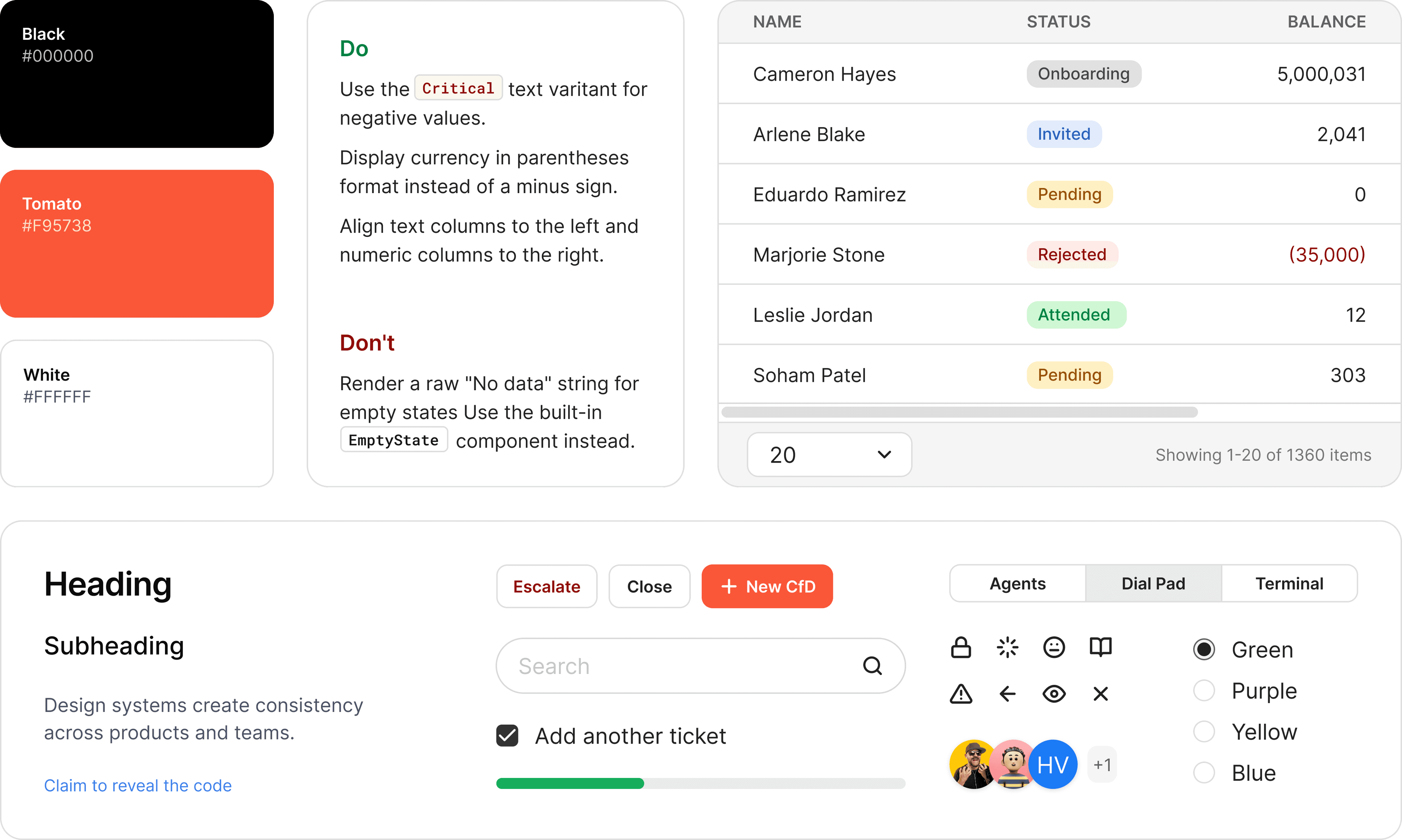
The problem I kept running into
As the sole product designer in an enterprise outsourcing unit, I ship products on two-to-three-month cycles. New project, new client, new brand, often a rotated team. Three costs kept compounding:
~3 days lost to setup every project
Undocumented rules that reset on every rotation
Design files that need a walkthrough to read
How can I speed up the design process and maintain UI consistency across projects, teams, and rotations?
Finding the right approach
I considered several approaches, weighing the pros and cons of each.
| Approach | Pros | Cons | Decision |
|---|---|---|---|
| Simplified DS |
|
| Selected Most enterprise admin interfaces share similar UI patterns, so fewer components still cover the majority of cases. |
| Common rules in Figma(component behaviors, verbiage guidelines) |
|
| Selected Accepting minor awkwardness in edge cases is a better trade-off than designing every screen from scratch. |
| Annotation kit in Figma |
|
| Selected Visual noise is manageable with consistent placement. One 15-min walkthrough per project is cheaper than ongoing clarification calls. |
| Full DS |
|
| Dropped Not feasible for a solo designer on short project cycles. |
| Design-dev shared documentation(standalone spec site or wiki) |
|
| Dropped Maintenance cost is too high for a solo designer managing multiple active projects simultaneously. |
Three selected approaches above form 3 layers in the new system:
Simplified DS
Tokens + Components
Common Rules
Journeys + Verbiage
Annotation Kit
Communication layer
Decision #1
Simplifying the design system, from tokens to components
Open source design systems have extensive token sets. However, most interfaces I designed use only half of them, the rest sit unused. So, to make it more compact and easier to maintain, I decided to:
Reduced the color ranges
The color scheme is also limited to neutral, primary (brand), along with four basic statuses: info, critical, and warning. Ten steps for neutral and five steps for saturated colors are enough to cover all use cases.
Instead of numbering scales like gray-100, gray-200,... I name base tokens with descriptive words: gray, grayer, grayest,... That's because our brains process meaningful words more efficiently than abstract numbers, so descriptive names remove the translation step and speed up the semantics-assigning workflow.
Removed component-level tokens entirely
I found it unnecessary to control tokens at this level. Removing them significantly reduces numbers of tokens, thereby minimising the risk of inconsistency.
Built only the necessary components
Applied the same logic to components. I audited five past projects and recorded which components actually appeared. Around 14 covered 100% of recurring screens. Every additional component adds maintenance cost without proportional reuse, so I stopped there.
Decision #2
Turning recurring decisions into rules
Pre-built common journeys
The most recurring flows like item CRUD, authentication, and content management, became journey-level templates, housed in a separate file linked to the design system to keep the main library lightweight.
→ Instead of redesigning from scratch, I just need to copy and adjust content.
Created slot-based copy formulas for recurring verbiage
Without a standard, every type of wording, a success toast, an empty state, a delete confirmation,.. gets written differently by every person who touches it. Fixed verbiage formulas give the team a pattern to follow directly.
Verbiage guideline for Confirmation Modal.
Built an Annotation Kit to embed communication directly in the design file
This kit reduces concerns by putting the answers right in design file:
- Status tags let dev team know which screens are ready to build, in progress, or blocked.
- Negative Space lists error and edge case states next to the screen, so the designer does not have to mock up a separate screen for each one.
- Conditional flow maps branching logic inline, without splitting into multiple flow diagrams.
- Shortcuts link to related component behaviors or connected flows, so the team can navigate without asking.
- Changelogs track what changed after cross-checks and revisions, so dev knows which parts were updated without re-reading the entire flow.
- and so on...
Annotations only work if the team knows they exist. In the project kickoff day, walk the dev team through the annotation types in a 15-minute session. After that, the annotations are self-explanatory. This initial walkthrough prevents them from being ignored entirely.
Measuring the impact
The system has not yet been deployed in a live project. I chose the metric I could validate during the build itself: setup speed, because that was the most painful cost in every past project. By reskinning the system to a new brand and adjusting content for core screens, setup went from 24 hours to about 4 hours (~80%).
In the next project, I will track three adoption signals: number of clarification calls per sprint, onboarding time for new team members, and UI consistency across designer rotations.
Final thoughts
This system is not trying to be incredible. It solves today's problems and is built to grow as needs change.
That said, the ground is shifting fast. Now AI can generate UI, token structures, even entire flows. When that becomes the norm, the value of a design system is no longer the files it produces.
Tools will keep evolving, but the judgment behind them will not automate itself. Knowing what to keep, what to codify, and what to leave flexible is still our job.